Overview
GoodFin is a Y-Combinator startup that lets you invest in companies like Space X, Anthropic & OpenAI. I worked closely with C-Suite, engineering and cross-functional teams to design and launch the investment platform.


Overview
GoodFin is a Y-Combinator startup that lets you invest in companies like Space X, Anthropic & OpenAI. I worked closely with C-Suite, engineering and cross-functional teams to design and launch the investment platform.
Role
Founding Product Designer
Team
C-Suite
Engineering
Product
Compliance
Advisors

To invest in a private company, you need two things:
That means only 3% of Americans can invest into a $4.2 trillion dollar asset class - one that has consistently delivered 2-3x higher returns than the public market.
HENRYs (High Earners, Not Rich Yet) often struggle with this problem.
They want to invest in private companies—and have the means to do so—but can't. Due to not being high-net worth today, in the present.
13.5 million HENRYs earn $100,000 - $999,999 annually. Representing a $270 billion dollar addressable market.
We could build a platform that aggregates smaller investments into larger allocations, and monetise it through sustainable unit economics (like management fees and carry).
Measurements for success:

Since financial products are complex (and money is often personal), I used the Jobs-to-be-Done framework to understand how people invest, and why.
I structured our research into two seperate phases.
In Phase 1, I analysed the market to understand the competitive landscape. In Phase 2, I conducted user research to uncover emotional drivers.
This approach proved essential for revealing the deeper motivations behind building long-term wealth.
1. Market Research
To understand our target market, I dove deep into financial forums, Reddit communities and industry reports.
Spending time immersing myself in the online conversation, helped me get to grips with HENRYs and their current situation.
Quantitative data revealed some interesting figures:
78% of the target demographic expressed a strong interest in private investing. While 65% said they "didn't know how to get started" as their primary barrier.
This gap between desire and access became the foundation for our product strategy.
2. Behavioural Interviews
I conducted user interviews with 24 participants, to further understand their investing experience.
Participants included lawyers and software engineers (that strictly met the HENRY criteria).
Our discussions focused on understanding the short and long-term emotional drivers around building wealth, and financial security.

Our user research led us to creating Vijay: a HENRY that has spent the last few years working at a fast-growing startup. Now in his mid-thirties, he wants to make better financial decisions and set his family up for the future.
“How might we create an compliant, user-friendly platform that allows a HENRY to secure their future?”

The challenge was to balance the complexity of a highly-regulated industry, with the simplicity found in great digital products.
My solution to this challenge was to design a hub-and-spoke architecture with three key user flows:
I. Trust & Transparency
Every step should include a clear explanations of fees, risks and processes. Helping a user to build confidence in making financial decisions.
II. Progressive Disclosure
A step-by-step approach to introduce complex financial rules and regulations gradually. Preventing cognitive overload.
III. Compliance by Design
SEC/FINRA regulatory requirements to be seamlessly integrated into platform and user experience.
We explored an exclusive private club model with membership tiers, invitation-only features and early access to premium investment opportunities.
We rejected this model because, as a startup with 0 customers, user acquisition was critical to validate product-market fit.
Exclusivity would have slowed adoption down, at a stage when we needed to prove a strong demand.
I. Engineering
To ensure fast and seamless execution, I worked closely with our engineering team to establish a design system with clear handoff protocols.
Reusable components helped speed up the design/development process. Helping us to rapidly iterate on user feedback.
II. Compliance
While the CEO and advisors took care of the backend, I translated our regulatory and compliance-based requirements on the frontend.
This meant designing user flows that prioritised clarity while adhering to those requirements.
III. C-Suite
I worked closely with C-Suite, taking part in business development meetings with Stripe (to explore payment integration), Assure (for deal management) and Plaid (for KYC/KYB functionality).
I took ownership of the product's strategic design, regularly contributing to strategy and key decisions.
Frequent alignment over Zoom kept product design and development in step with growth targets. I worked closely with our stakeholders to generate solutions, product targets and success-based metrics.

I began by synthesising our user research and sketching multiple flows. Emphasis was placed on how HENRYs can get from A to B, with the least amount of friction possible.

Next, I built interactive Figma and HTML/CSS-based prototypes for our 3 core user flows. Then tested the these with 8 different users.
Once testing had concluded, I translated these prototypes into a scalable design framework that we could build from.
I then started to bring the product through high-fidelity design.
This meant (i) creating a visual language that would resonate with our audience, (ii) micro-interactions to strategically guide users through core flows and (iii) progressive profiling to break lengthy and complex forms down.
What resulted was platform that balanced regulatory requirements with user trust, and provided a seamless UX/UI for HENRYs to use.

Tests were conducted using the aforementioned prototypes and task-based scenarios.
My objective was to measure both task completion rate and time-to-completion - two essential metrics for optimising the product.
Based on user feedback, I:
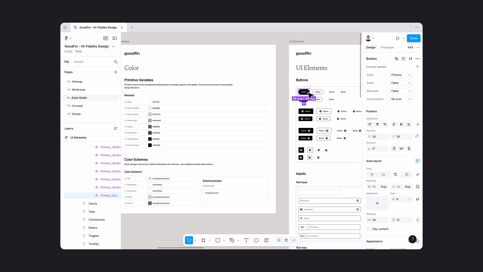
Component Library
A component library with elements that could be reused by the engineering team, to enable a consistent and efficient development process.
Accessibility Standards
WCAG 2.1 AA intergrated throughout the user interface. With colour contrast, clear typography and intuitive UX patterns.
Responsive Design
Flexible UX/UI layouts for desktop, tablet and mobile; adaptable for users that want to complete onboarding on the go.

I. Regulatory requirements could degrade the user experience, if not properly integrated.
By creating step-by-step flows that gradually introduced regulatory information, we transformed what could have been overwhelming for new users.
II. Identity verification (through Plaid, SumSub or Ballerine) require specific UX patterns.
I developed a simple verification flow that integrated those UX patterns, and utilised the psychological principles found in account setup.
III. Complex financial decisions are researched on mobile, then executed on desktop.
I designed a mobile-optimised experience to accommodate this particular paradigm. This meant ensuring both research and complex financial decisions could be made across all devices.
Product-market fit with sustainable economics, a scalable design system that reduced development cycles, and a base of trust to build from.
The opportunity to expand and diversify by creating more financial products. Attraction from venture capital and private equity into the business itself. A pioneer in the private equity space.
JTBD Effectiveness
The Jobs-to-be-Done framework proved far more effective than traditional persona-based research.
While personas helped us fathom demographics and behaviours, JTBD revealed the emotional drivers around wealth building and financial security.
This allowed us to address the fundamental apprehensions which surround complex financial decision-making.
Progress Disclosure Strategy
Our progressive disclosure strategy reinforced a critical principle: users need confidence-building information architecture that doesn't overwhelm their initial experience.
While competitors either oversimplified (losing credibility) or overwhelmed (and lost its users), we found the middle ground to built trust from.
Compliance Reframed
Regulatory requirements became a source of innovation, rather than a limitation.
Early considerations improved our user experience, by forcing us to think systematically about trust-building and transparency.
Reframing "how do we work around regulations?" to "how do regulations help us build more trust?" fundamentally changed our approach.
Following the successful launch of the platform, GoodFin has continued grow and scale.
It has recently been featured by Forbes, Yahoo Finance and the Financial Times; providing HENRYs access to investment opportunities with companies like Anthropic, SpaceX & OpenAI.